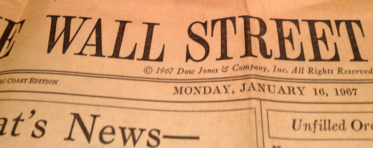
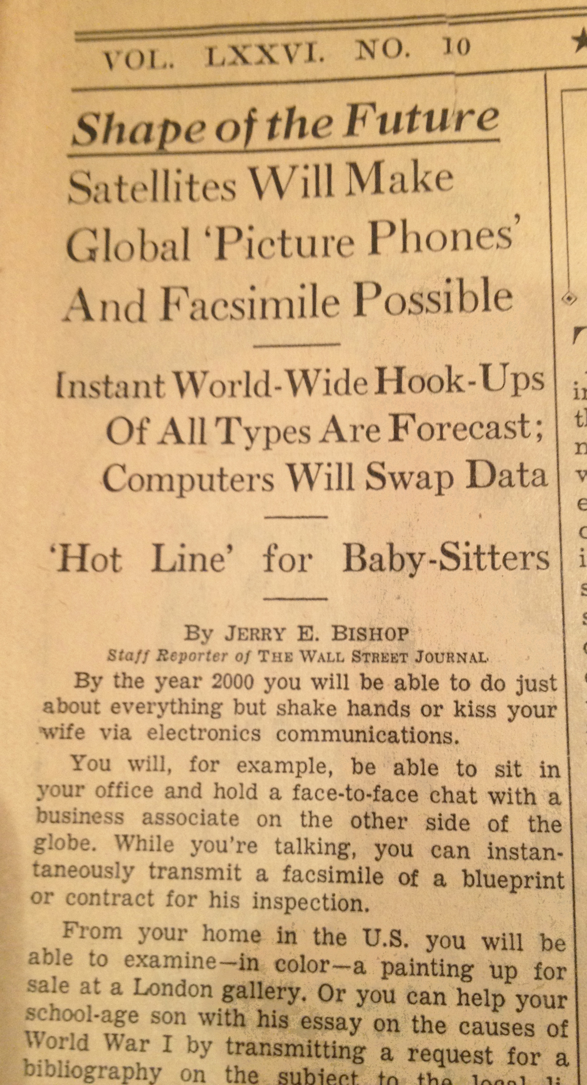
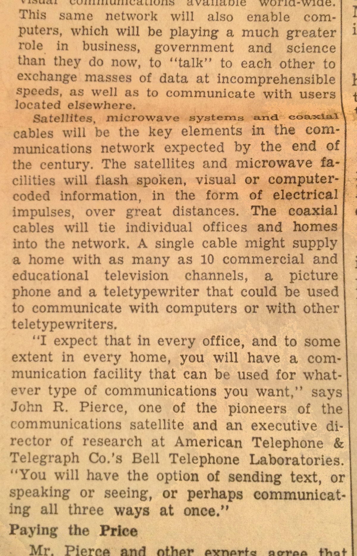
Look what I found while helping my mom clean out her garage: a yellowing front-page Wall Street Journal article from January 16, 1967, which I photographed, cleaned up a little, and posted below. It predicts all sorts of globe-spanning electronic communications: Picture phones, fax machines, and devices that allow you to communicate via "sending text, or speaking or seeing, or perhaps communicating all three ways at once."
Sadly, I only found the first page of the article. Lord knows what reporter Jerry Bishop predicted in the subsequent pages. Social media? Stuffed-crust pizza? Hologram Tupac?
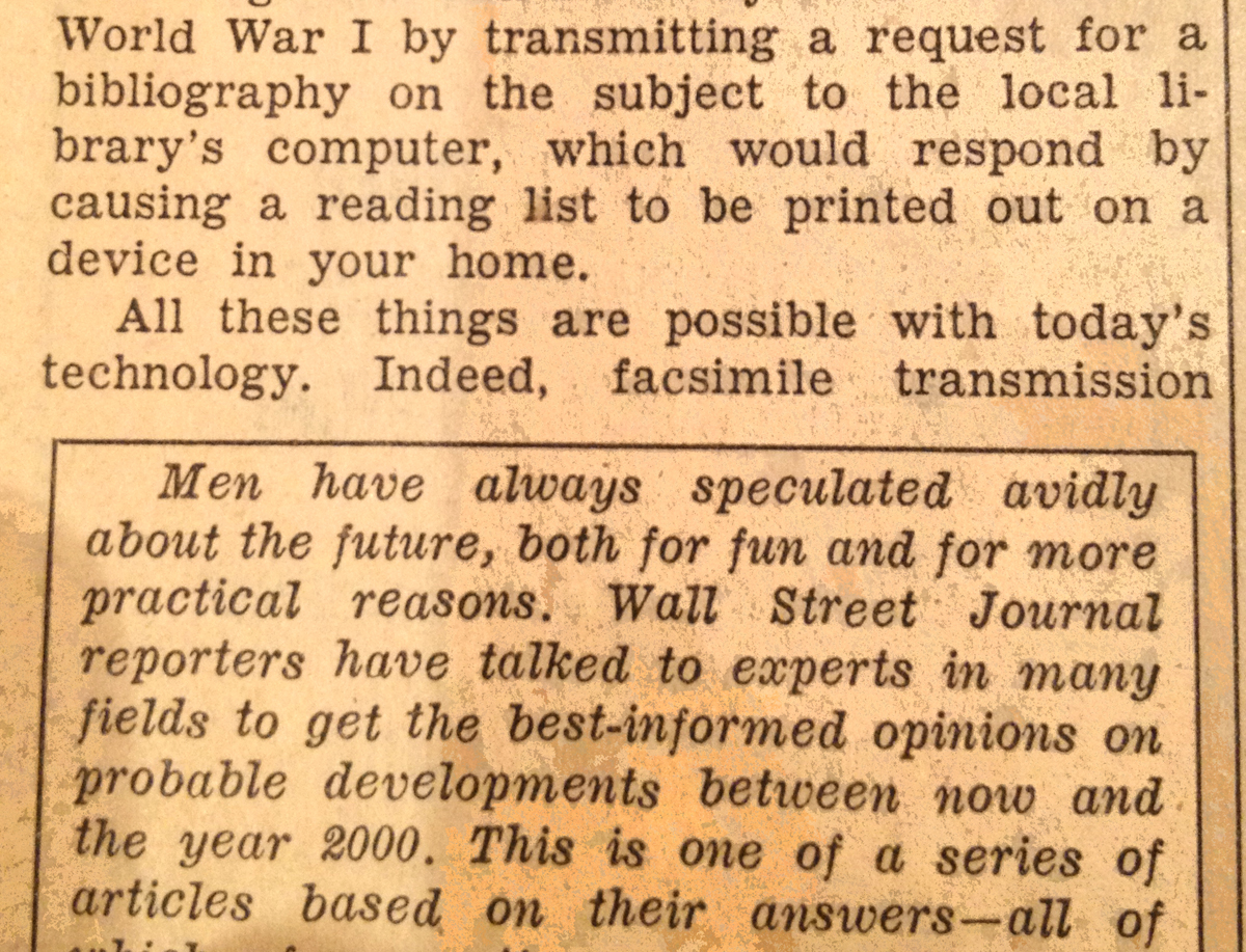
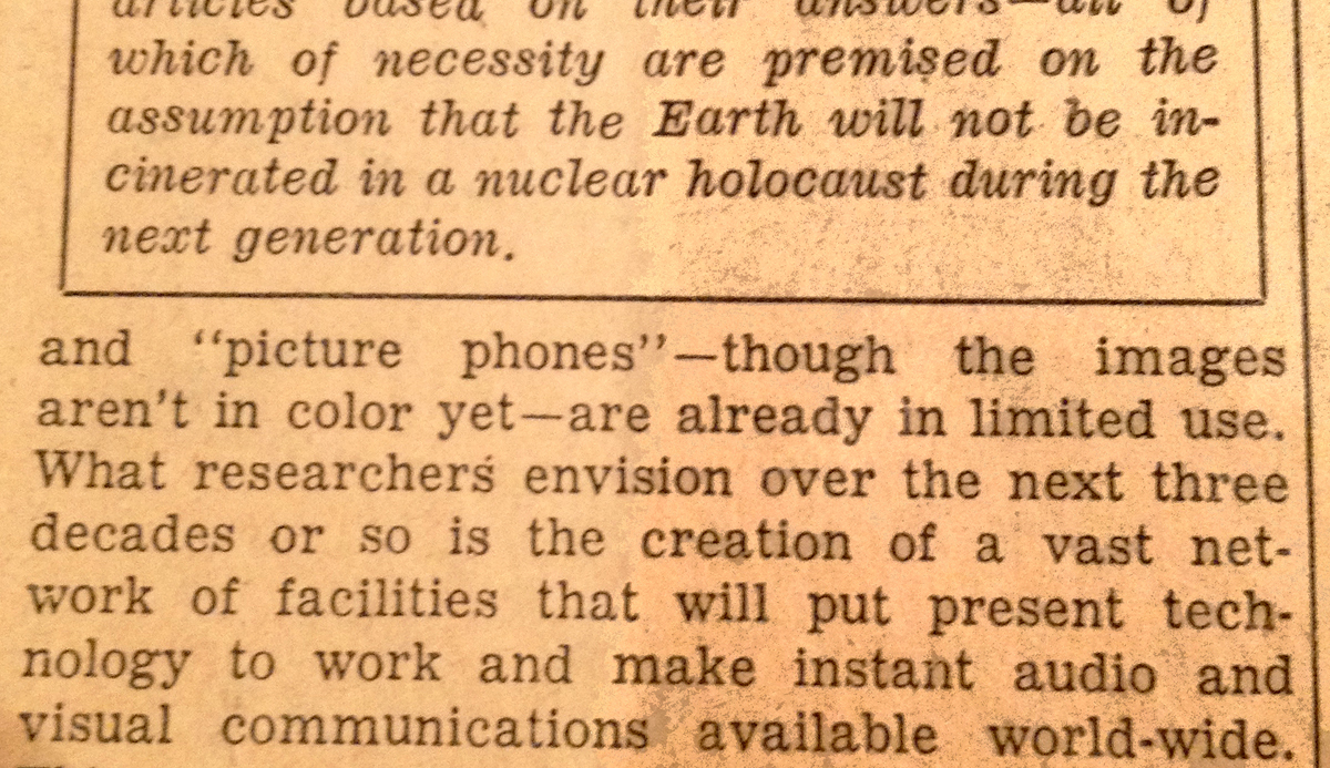
My favorite part is Mr. Bishop's caveat that these predictions are "premised on the assumption that the earth will not be incinerated in a nuclear holocaust."
Interview conducted for Want Magazine in Spring of 2010.
Dan Saffer is a man with strong opinions, varied interests, and quite possibly, a distaste for the term “User Experience.”
Mind you, Saffer is far from “anti-usability.” His track record as an Experience Design Director at Adaptive Path, a founder/principal of design consultancy Kicker Studio, and the writer of Designing Gestural Interfaces, should put paid to that. He merely feels the term, when applied to an industry, bites off more than it can chew.
We traveled to SF’s South Park neighborhood to interview him in Kicker Studio’s echo-rich, dog-friendly loft offices. It was late on a Friday, he’d had a crazy week and casually nursed a glass of Bourbon as we talked about UX, robotics, magazines on tablets, and how good usability should help us forget that computers areeverywhere.
User Experience, Defined
Want Magazine: Beyond the textbook definition, what is user experience to you?
Dan Saffer: What is User Experience? Well, there’s a lot of different ways of thinking about it…User Experience for me is kind of the overall picture, what used to be called “creative direction” is now called User Experience, because it contains everything from architecture to industrial design to visual design to interactive design to sound design. A very kind of holistic umbrella term that encompasses all of those things under it.
All those disciplines to me are in service to an overall experience. To me there aren’t very many actual user experience designers. There are people who are doing different disciplines sometimes at different times under this user experience banner.
It sounds like what you’re talking about is it’s a much bigger tent than it used to be–so big that you don’t find people that have a skill set that encompasses it anymore.
I think that’s definitely true. It’s very hard to be very good at disparate fields like architecture and content strategy. There’s a pretty broad range of skill sets in there depending on the kind of product that you’re building.
If it’s an interactive product, for instance, you may have an industrial designer, you may have service designers, sound designers, all kinds of things, or if it’s a website, you may have visual designers, architects, content strategists, copy writers, all those people. So it can be very different people working at very different kinds of ways, all under User Experience.
Robotics: Keeping Us Clean and Sane
DS: The next big wave after touch and gesture is probably going to be robotics. That’s my guess, anyway.
What are you seeing at the consumer level currently that is interesting?
Currently the one that’s really out that people just adore is Roomba. That’s the one that everyone loves, everyone names them, puts stickers on them, talks to them. They really think of them as being family members. And it’s just a really kind of fascinating item.
Certainly there are other cultures, Japan, Korea, that are far, far ahead of us. Korea has a whole department of robotics, like a Ministry of Robotics or something, where they want to put robots in everyone’s home by, I think it was like 2015…Because they are facing, as we are here, a glut of people who are becoming old, who are becoming elders. And in order to care for them, they see robotics as a real solution to that.
An automated solution.
Right—do small automated tasks that are difficult, or can help provide things like security and communication…and mobility tasks that become difficult for people as they get older. So I think there’s a real growth market there that’s untapped.
We were just at CES last month, and there was a really amazing, this robot seal that they had there. It was mostly for autistic kids. And it was really beautiful. I thought it was going to be really creepy, but it was actually this really great seal that they could hold, and it purred and it felt warm. As you stroked its fur, it had touch sensors so that it really woke up and responded in a very kind of real way, and they say that it’s really great for kids with autism. That they really start to respond to it. And for elder care. People who just need comfort.
How To Build “Want” Into an Experience
DS: If something’s not usable, it’s eventually not going to be desirable, certainly not for the kinds of tools that I make. For jewelry or something, all that matters is that it’s desirable, but for interactive products, eventually if it’s not useful, you’re not going to want it, eventually. It’s going to go away.
But how do you create that desire is a really tricky and hard question. And some of it is about creating products with personality. What is the personality of the product, and how does that personality manifest itself? And is that something I want, as a consumer, in my life? Does this somehow reflect me or who I want to be? Or is it simply appealing, something that I want to spend time with?
That was what was so great about the site Mint, was that it had this really conversational tone. It had a kind of friendly, appealing, easy to understand, jargon-free persona about it that was just refreshing when it came time to think about financial service. So it was like, “Oh, this is something new, something that I would want to spend time doing…” Other banking sites may be more useful or usable, but they’re certainly not more desirable, because it feels like spending time with them is spending time doing work. It’s a chore. To slog through them and put in your data and all those kinds of things. It’s not a pleasurable experience.
The Value of Advertising and Marketing
How much importance would you put on marketing and advertising towards achieving product infatuation?
Marketing and advertising plays a huge part…And as much as we try to, as designers, there’s this reflexive, “Oh, God. Marketing and advertising.” A lot of times it is a core component of what we’re trying to do. I think one of Apple’s secret weapons over the years has been its marketing and advertising. There’s no way that Apple would have had the success that it had with the iPod and the iPhone and stuff like that without its advertising partners.
It doesn’t matter really how usable or useful something is if no one’s using it! If no one can find it, or no one’s heard about it, you can have the greatest product in the world, and it may not matter. Sites like social media sites are a perfect example of this: Unless you have enough people to populate it, it just withers on the vine. You could create the next Facebook that is so much better (and some would argue that that wouldn’t be very hard to do). But if you don’t have that core group of people, then it just doesn’t matter. And I think that’s where marketing and advertising can play that key part.
Now, certainly, designers can make it easier on them by creating products that are beautiful and display their functions in a beautiful way and are approachable and all those good things that we really strive to do.
A lot of what we do here at Kicker are new technology [projects]. People come to us and say, “We’ve got this [brand new technology]. What can you do with this? What is the product here?”
And so some of that is figuring out: what is going to make people want this thing? What’s going to drive it? And for us [our priority is], what’s the personality of it? How is that going to make people want to even think about adopting it? How am I going to try this for the first time? With new products, especially with things like touch screens and gestures, which we do a lot of, there’s this hesitation, like, “Am I going to break this thing? I’m afraid to try it because I’m going to look stupid doing it.”
But [our job is] really to make [people think], “No, it’s really fine. Just try it. It’ll be okay.”
That’s really important with new technologies in particular. Because people come to it with expectations that may or may not be met and how you’re able to meet those expectations and hopefully exceed them. Or, when the expectations aren’t met how, do you fail in a way that’s not off-putting? Failure is really a chance to product personality.
Flickr does a great job of this. When something doesn’t work, it tells you why. It offers a suggestion, like, “Hey have you tried this?” There are ways that failure can be a place to show personality.
Is Usability for Conversion, or Retention?
Is the interaction designer’s job to influence initial adoption, and purchase, or is their job to make the user experience enjoyable for the long run?
It’s definitely some of both. Alan Cooper has a great thing about this, where he says, we spend way too much time on those initial moments when people first start using it, and then we neglect all the people, once they get past that, when they’re intermediate or advanced. It’s like we’ve given them no tools, and then the product seems too simplistic for them.
So it’s a hard balance to strike. How do you give enough meat for intermediate users, which is where most people end up being, while not being too intimidating for someone coming at the site for the first time?
You have to build up a product knowledge that leads people as rapidly as you can into being intermediates. But you still have to design those [adoption] hooks into the service.
I think one of the great things about Blogger back when it started 5 or 6 years ago; it seemed just like this FTP service. “What is this thing?” And when Jeff Veen and some of the guys at Adaptive Path [took it on], they said, okay. It’s three things. And they really aligned it, you do one step, two step, three step. And they made it so very straightforward that all of a sudden adoption just took off. Because there was this three simple steps that led you into becoming a blogger. And I think that was brilliant.
You can do those kinds of things that are basically little attractors…that really get people hooked in. And the history of that goes back ages and ages. Think about old video arcade [games]—they would tease you as you walked by the video game. It would be playing a little movie. And you’d be like, “Hey, that looks interesting. I can put a quarter in and start to shoot or move the joystick around.” That little attraction affordance to draw people in is an important piece to design.
Building for “The Long Wow”
DS: Now certainly that’s not all you should design. Then you get into the meat of, “Okay, now you’re here, you’ve got all this. You have tasks that you need to do.”…No matter how entertaining it is, you still have to get stuff done.
One of the things that interaction designers can do is what Brandon Schauer calls “The Long Wow,” where over time, you keep building in these things that you discover, not your first time using it, but your fiftieth time using it, your hundredth time using it. Those things that are really important over time, so you keep getting reinvested in the service, because they keep giving you something. They keep rewarding you for being a long time user. If you can think about them and really design them in from the beginning, It’s a really great thing.
I mean, obviously, some of that stuff comes after people have used the product for a long time…People start to suggest things: “Why don’t you have ‘x’?” Or, “This would be really helpful,”…which is of course it’s own danger. And then you start adding stuff, and the product can drift away from what it was originally done for.
The “long wow” you just described is very similar to what makes a good multi-level game. Everything from the shelf appeal to the hooks that you’re talking about.
I think there’s so much that interaction designers can learn from game designers. There’s always that idea of a reward. What am I leveling up to? Or, what am I resourcing here? In some cases it might be money. In some cases it’s time. In some cases it’s effort…It’s interesting.
Because…the things game designers think about first are the emotion, and “What is the aesthetic appeal of this?” And then they say, “What are the game mechanics that can cause that?”…More thinking like a game designer, thinking, “What’s the aesthetic appeal? What’s the emotional appeal that we’re trying to do, and then how can we start to structure the product to achieve those goals?” Is an interesting way to start thinking about designing products.
On Mag+ and Touch-Screen Magazines
There’s a project that you guys have worked on recently, the Mag+ demo. That is something that we’re particularly interested in, especially because we’re a magazine entity, and we’re interested in moving to a format like that.
Mag+ is a really interesting project. It’s with the magazine publisher Bonnier, who are Swedish and they do every kind of magazine you can think of, from cooking magazines to Field and Stream, to Photography, Popular Science…this pretty wide range of magazines.
They worked with our friends in London, a company called BERG, and they did kind of a concept video of how magazines might work in this kind of new world of e-readers. But they didn’t want the [usual] kind of e-reader experience. And they didn’t want the .pdf experience. They really wanted to capture what it was like to read an actual magazine. Because magazines have evolved over the last 250 years, 300 years, something like that.
Actually one of the first things I did when we got the product was actually go back and read the first magazine.
Really?
Yeah, that was the first thing. And surprisingly, there were a lot of the same things. There was still a table of contents, there was still an appendix. There were still lots of short articles, those kinds of things.
So…our job was actually to take that concept and really prototype it and make it into something that would actually work. That would actually go ahead and would eventually be built and that had buy in from all the magazine’s editorial staffs at these magazines and from readers. That it was something people actually wanted to sit down and curl up and read these magazines like they would a normal magazine, a physical paper magazine right now.
That’s why right now currently our walls in the studio are just covered with magazines that are torn all to bits. It looks like a magazine stand has exploded in here or something like that. But [we’re] looking at all the content types that we needed to support. Everything from table of contents to long articles to short articles to timelines to graphics to advertising to classified ads. All different kinds of content that we really had to support.
And then we had to say, what are some of the–what’s it like to actually do page turning in this kind of digital world. Do we still have to have a physical page turn? How can you tell when you’re done reading an article?…We really wanted to keep some of the structure of magazines. And so some of that was finding out what that structure was.
One of our mandates was that it didn’t feel like a piece of software. It wasn’t something that you booted up and had to download and read this whole thing. It wasn’t a chore. It was a magazine. It was something that you’re going to flip through as you’re killing time, or you just want a little bit of information, you want to immerse yourself in it. You don’t want to think about all the parts of it, or how do I then flip a page, how do I do all these…You just want to read the magazine.
It’s really kind of a fascinating project. How do you turn something that was previously, I don’t want to say dumb, but without the digital intelligence, and how do you turn that into something with a kind of intelligence—but not ruin the experience? How do you translate the experience in a way that doesn’t feel wrong, that doesn’t feel like work, it doesn’t feel like I’m reading a .pdf.
So that’s been the real challenge with it. And we’re just finishing up prototyping right now. So I imagine by the time people hear this… Bonnier will have released it.
What’s the next step for it? Would Bonnier offer it as hardware? Would they offer it as an app for the iPad, or…
I think they’re figuring that out. My guess is, from what I know…that it’s something that will be delivered on various platforms as some kind of pay in service.
That being said, there certainly could be [opportunities] where they could sell their own reader…maybe there [should be] a special Bon Air reader…that’s customized for magazine reading specifically. That maybe has things like, it can get wet! We found that an amazing number of people read in the bathtub.
On His Book, Designing Gestural Interfaces
I read an interview where you said that you wrote Designing Gestural Interfaces because at the time, there was no substantial resource on this particular subject.
Right. Because I started writing it, probably…two-and-a-half, three years ago…Prior to that I had mostly done web work. But I suddenly started finding myself doing a lot more touch screen work…So I started trying to research the subject, and was finding it very difficult to get good solid information about it…just the basic stuff. Like, how big should the touch target be on the screen for someone to reasonably tap. And I couldn’t find it.
So I said, “There’s clearly this hole in the market.” And I just set about writing the book. Because I knew that if I didn’t write it, someone else would.
The Rise of Touch Screens
DS: It’s an interesting time because we’re definitely in an interaction revolution…A lot of the paradigms that we’ve used for 40 years now, things like cut-and-paste, we still have them around. The laptop’s not going anywhere quite yet. But now we have this new language on top of it that is the language of gestures and the language of touch.
So projects like Mag+, a couple of years ago, would have been totally different. You would have had buttons on the side like you did on the early version of the Kindle. And that’s how you would be flipping pages. You couldn’t just swipe and flip a page. You just, it wasn’t going to happen. And now it just seems like a natural thing.
I mean, granted, touch screens have been around for almost 40 years at this point, but it’s really taken that long for the technology and the market to mature to the point where—getting back to that desirability thing—where people really want them. They see the value in it and can then say, “Wow. I want that in my stuff.”
And now we’ve almost gone overboard with it. Now it’s like, “Let’s put touch screens in everything. Your toilet now has a touch screen on it.” Someone actually called me about having a touch screen in a shower.
The less said about it the better. But it’s interesting to think you can have computing power in places where you never had it before. And that’s both good and bad, of course. Why does my shower have to be invaded by my email? It doesn’t. I like that five minutes in the shower where I don’t have to think about anything.
Fear of a Blank Tablet
DS: [With touch-screens], there is this kind of like, “As soon as I’m touching it, I’m already doing something. Oh wow. I didn’t have to click on it. I’m touching it. Now something’s happening.” Which is both good and bad.
There is definitely this odd fear factor, and it’s kind of a physiological one. Some research figured out that people are actually afraid of being electrocuted as they touch electrical objects. It’s like a fight-or-flight thing. And getting people over that is a major concern. Which is why that really nice slide to unlock thing on the iPhone is really nice. It’s this really simple thing like, “If I can do that…” “Oh! It unlocks!” and “Oh, there’s some other stuff here I can touch…”
UX: The Front Line of Modern Life
Do you think that in this heyday of touch screens, with the iPad coming out, with Microsoft Surface, is this heralding a new era in user experience?
Yeah. It is an interesting turning point in time. Because all of a sudden, computing power is so cheap it can be disseminated everywhere. It’s on surfaces, on walls, on tables. It’s in our pockets. We’re just surrounded by it all the time.
And user experience and interaction design is playing a big role in that introduction of this new technology, what we can do with it, and how it can hopefully make our lives better—and not make our lives suddenly overburdened or crushed by information.
All those things that really could happen. We could lose all of our privacy. We could lose all these things that we now take for granted, but could easily be taken away from us, thanks to the technology that we’re trying to get people to buy.
So it’s an interesting time. And really, I kind of see user experience people being on the front line of keeping technology, and what it can do for us, really making it for human beings. And I think that the good that we can do for the world, is really make this stuff useful, usable, desirable, and not overburden us—and treat us with the dignity and respect that we should get as human beings.
It’s kind of a hard thing to [realize] when you’re in the middle of a project, and you’re cranking out these deliverables and doing your wire frames or your site map, your CAD drawings…But this stuff goes out in the world and it makes a huge difference to people. That’s why I do it, really.
Thanks to David Gomez-Rosado for his assistance with this interview.
An interview I conducted for the now-defunct Want Magazine, back in Spring of 2010.
Here’s the secret to a great interview: find a savvy subject, ask him or her the right questions, and stay out of the way. Lob in your pitches and let that person across from you swing for the fences.
Such was my interview with Peter Merholz, co-founder and co-president of Adaptive Path. Peter has the unique ability to speak in paragraphs—meaty ones, with continuity and coherence and a minimum of “um”s. Interviewing him saves on transcription because there are so few carriage returns.
It doesn’t hurt that Merholz has worked in interactive media since the early-90s CD-Rom days, served as a designer at the estimable Studio Archetype, and in 2001, co-founded Adaptive Path, arguably the first consultancy devoted to User Experience research, development, and training. Plus, legend has it he coined the term “blog.”
We ventured to ‘Path’s South Park offices to talk with Merholz about the dominance of Apple, the triumph of the Wii, what the next wave of Personal Computing might be, and much more.
Want Magazine: Adaptive Path has been around since about 2001. Would you consider yourself the first agency or provider of this type?
Peter Merholz: We were probably the first agency that specifically offered services around user experience. Other agencies had user experience as part of a larger set of capabilities they provided–Organic, Razorfish, Studio Archetype, where I worked during the first wave–but they were design firms, and user experience was a part of what they offered. Adaptive path was pretty much the first agency that focused on user experience and not just usability; that would be the other distinction. There were usability firms, but not really user experience firms.
When we began, we focused on customer research, then information architecture and interaction design. We’ve expanded to include product strategy. So [we’re] going earlier in the process to help clients. And then farther down the process, and to visual design, and prototype engineering.
The other thing that’s probably changed is in 2001, we were focused solely on the web. Now, we’ve worked in mobile. We work in embedded device software. We’ve even done retail environment design. So we’ve expanded the platforms on which we are doing this type of “experience design” work.
I noticed from your writing and from what I’ve seen on the Adaptive Path Blog is that one of the services Adaptive Path provides is “experience strategy.” How do you create a successful experience strategy?
One of the things that we found missing when we were working was a good understanding of why [our clients] were doing what it is they were doing. They would often have a set of functional requirements, some type of brief that they were meant to execute on…and we would start asking questions, and there weren’t answers to them. So we developed this capability or methodology around discovering an experience strategy.
An experience strategy is meant to be another way of thinking about product strategy. But instead of simply as a go-to-market strategy, or what are the market segments we’re trying to hit, and all that stuff, what is the experience we want to deliver? What is the feeling we want to create through the device? How are we articulating that? Is there an experience vision for the device, or service that we can be living up to? Experience strategy, for us, is defining and articulating the desired end-experience early on, so that your subsequent design work has a focus.
With an experience strategy, the way you solve those design problems are organized and coherent, because there’s an understood common objective towards what it is you’re trying to deliver.
It sounds like what you have is a way of building in or baking in the outside-in experience that I’ve heard user experience experts talk about.
Right. It’s very much a response to what is typical from strategy, which tends to be very inside-out: “Here’s who we are, and what we want to put out into the world. Here are the capabilities we have.” [For instance], a technology-driven company will have a very capabilities-driven strategy: “Here’s the features and functionality that we’ve developed. Let’s put it in a product and put it out in the world whether or not people want them.”
A more marketing-driven organization will have a more brand-driven strategy: “Here’s who we want to be seen as in the world,” and that will drive it.
The key difference with experience strategy is it begins by trying to understand what it is that customers want–what is it customers are asking for from this interaction with your company?–and use that to drive the strategy. Use that as the set of key touch points to think about how to organize the design work moving forward.
So it’s a way of insisting upon those learnings, making sure that that stuff is hard-wired into the product.
Exactly. Yeah. There’s a way of thinking about it, a visual way of thinking about it, at least when it comes to software that we use. A very simplified way of thinking about it. But if you think of software as a set of concentric circles. You’ve got at the outermost circle, user interface. The next circle is logic, the programming. And the core is data. And too often organizations focus on what they have at the core, and then just figure out how to express that out. They start with the technology.
What we argue is that customers don’t care about what’s in the center. All the customer sees is the interface. And everything else to them is magic. They shouldn’t expect to be expected to know how it works.
What we’re saying is because of that, you want to start with the customer as well, thinking about what is that experience that they’re looking for. And design from the outside in. Let the desired experience, and the desired interface drive the software and drive the data that you have, instead of doing it the other way.
Now this is something you referenced heavily in a book that you wrote for O’Reilly.
Yes. Four of us here at Adaptive Path wrote a book called Subject to Change: Creating Great Products and Services for an Uncertain World. That’s a mouthful in the subtitle. This book was really an attempt on our part to articulate our philosophy about how to do product and service design. It’s not a book of methods or step-by-step. It’s really trying to help impart a mindset that organizations can take in that helps them think about their problems in a way that we think will be successful in what we refer to as “an uncertain world.”
The idea that the world is getting smaller because of communication. The idea that you’ve got microchips embedded in everything, and products are getting much more complex. There’s a lot of confusion and craziness happening in industry. So an obvious one right now is media. The media industry is totally in an uproar. Whether it’s the music industry getting Napster-ized, whether it’s the newspaper industry getting all its revenues taken away by Craigslist. What’s happening now with publishing? Is the iPad going to save publishing? There’s the fact that you could consider Google a media company because it actually generates all of its money from advertising, which is a media revenue model.
So there’s confusion out there and things are changing really rapidly. We wrote the book to articulate how companies can react appropriately, which is to step back and, starting with the customer, figure out what it is people are trying to get down. Figuring out what it is that people want, and then gear the work that you’re doing to deliver on that.
Beyond the textbook definition, what is user experience to you?
Here at Adaptive Path, we’ve been shifting–to a certain degree–away from “User Experience,” and towards “Experience Design.”…We actually think of User Experience in the way that Don Norman [who coined the term] originally intended it, but which kind of got lost. User Experience became essentially a synonym for user interface. People didn’t realize that there was any difference between the two.
“Originally, Don’s conception of user experience was to think about the entire experience the user is having with the product, from the packaging, opening up the packaging, taking out the manual, reading the manual, turning on the machine, installing software…All of that he considered the user experience: not just the software interface, but every step in what you also now hear of as “The customer’s journey.” [It’s about] all of those steps–and thinking intentionally about delivering greatness at each of those steps.
This is something that Apple still does today. If you buy an Apple product, starting from going into an Apple store now…and the interactions you have with the people there, buying the product, taking it home. The famous Apple un-boxing experience that no one has been able to match. Opening up, let’s say it’s a laptop, turning it on. There’s a lot to guide you through the initial installation and setting up your user account, etc. Transferring stuff over from a prior machine, etc. All of that I would consider user experience.
Is it possible for, especially for architects of user experience, to manufacture WANT? To create desire in a product or service, either in the initial the purchase or conversion, or in the continued use of the product?
So you asked a yes-or-no question. The answer to which is yes. But I’ll try to expand further.
The thing that we can’t manufacture are needs. And I think it’s important to distinguish between needs and wants. Because I think from a more traditional marketing standpoint, there’s been a lot of belief that you could create needs.
You can’t create needs. You can influence how people respond to those needs. You can try to shape people’s approach to addressing those needs, but you can’t create needs. But I think you can, to a certain degree, manufacture want. I’m hesitant to use Apple as an example again, but they’re probably the best case of this. If you think about, particularly with their more consumer electronics devices, like the iPhone [or] iPad. They’ve created a want, right? People waited in line to buy an iPhone. And I think that’s a demonstration of an ability to create that want.
In Appreciation of the Wii
PM: I think with the Wii, Nintendo created a want, a desire that people might not have known is there. People have a need for play, for fun, and perhaps the other systems, the Xbox 360, the Sony Playstation weren’t tapping into it, because they’re too complex. But here’s this device, here’s this system, that allows you to tap into that need that you have in a way that feels right to you. And again, creates that want, whether it was the Wii itself, and the balance board, and all these types of tools.
For us, the Nintendo Wii is a remarkable case study of experience design realizing a whole new market. Realizing a whole new play space in the market, away from the hard core gamers, that had been simply ignored. No one thought those people wanted to play games. It turns out they did–they just didn’t want to play the hard core gamer games. They wanted to play lighter-weight, more casual games. Games that didn’t involve just sitting there and twiddling your thumbs. Games that maybe used your whole body. Games that encouraged social engagement in the room. That was an identification of want on Nintendo’s part that they met brilliantly.
Were they playing on the (relatively) universal needs of play and escape, and then creating want around those with this frictionless interface and the ease of use?
I think, yeah. Essentially they recognized–thinking about it more from an MBA standpoint here—they couldn’t compete in the product category in the way they had before. Both Microsoft and Sony had decided that the way they were going to compete was more technology, the latest technology, more polygons. Sony put a Blu-ray player in there. They were going to shove more crap in there.
Nintendo had actually lost the prior generation’s battle. The GameCube was a failure, compared to PlayStation 2 and the original Xbox. People thought Nintendo was an also-ran. And they decided, We’re going to try something radically different. Maybe it won’t work, but we’re going to try something radically different.
The hardware in the Wii is almost identical to the hardware in the GameCube. It’s just a bare leveling-up. But they recognized that there was this opportunity with a new controlling mechanism, with the accelerometer and the little camera in it, that they could have radically different game play. But the cost of goods for them was remarkably low, because the stuff in the Wii remote, an infrared camera and an accelerometer, aren’t that expensive. The hardware in the console itself is last generation’s hardware, so that’s not expensive.
So they were able to take essentially existing piece parts and bring them together in a really revolutionary way by thinking about how they could deliver a different experience for gamers–and realize a whole new market of, or tap into a previously untapped market of potential gamers. One of the things that we love about the Nintendo Wii case study as it were is that when the Xbox 360 launched, and when the Sony PlayStation 3 launched, both of them cost more to build than they were able to price them for. So both of them were loss leaders. And that was pretty typical in video games.
Sell the razor cheap and make it back on the blades.
Exactly. So the Xbox 360, they lost $125 per sale and Sony lost like $250 per sale thinking they were going to make it up with the licensing on the games on the other end. The Nintendo Wii actually made $100 profit per sale on the hardware alone, because they were using the last generation’s hardware. They were able to charge less: $250 compared to Xbox 360 and PlayStation, which were $400 and $500 [respectively]. They were able to charge less and still make a profit. And their insight was by creating a whole new experience we might be able to realize again, tap into this untapped market. And it proved true. It proved remarkably and wildly successful. The Wii has by far outsold Xbox 360 or the PlayStation 3.
Making The Product The Brand
Marketing and advertising are not what Adaptive Path does per se, but what’s your take on this: How does advertising and marketing contribute towards instilling want in a consumer?
I have a very mixed view of marketing and advertising. Because much marketing and advertising tries very hard to instill want, but deals with the service of a crappy product or a crappy service. So you might have great marketing and advertising, but if it’s handing you off to something lame, how meaningful was it? And all that might do is it might get somebody in the door, but then the product experience will be so bad that they just drop off. They never come back.
There are some interesting examples of tying marketing and advertising into a larger experience. Probably the best one I can think of involves the launch of the iPhone. If you remember, back after they announced iPhone at Macworld in January–but it didn’t launch until June–they had a set of ads. All the ads were was a shot of an iPhone and someone using it. And so what that’s doing is that is essentially serving as a manual of how to use this new technology. Because iPhone introduced some new interaction paradigms. There’s no buttons except for the home button. There’s swipe gestures. There’s multi-touch and pinch & zoom gestures. And so one of the things that Apple needed to do was get people comfortable with these ideas before they would start using them. And they ended up using these ads to do so.
Apple’s in a rarified position, because clearly all of this stuff, the advertising, marketing, product development, all rolls up to one man. But what it points out is marketing and advertising that isn’t being considered as part of this larger product development process is being given short shrift. Marketing and advertising needs to be considered at the same time as you’re developing the product.
That’s where for me the customer orientation from the outset is helpful, because it can also help the marketing and advertising better understand who it is that you’re trying to engage? What are the things they are concerned with? How can we communicate that to them meaningfully? I think when done well, marketing and advertising…can become that first touch-point in the customer journey. It introduces people to it, and then hands them off to, say a retail store where they can have some hands-on experience. And then they buy it. And then they have the un-boxing experience. And then they use it. But…that kinetic energy was built up with that initial impression that they got through a good advertising campaign that was germane to the whole product experience.
But too often, advertising is considered long after a product’s been developed: “Okay, now we need to market it.” And it’s considered separately from the product. It doesn’t really dovetail into that desired product experience.
Another company that is doing an interesting job in this regard is Southwest Airlines. I just flew Southwest recently. If you remember the Southwest Airline campaign, they use that “bing.” “You’re now free to move about the country,” which they get from inside the airplane’s “bing.” “You’re now free to move about the cabin.”
So, when you check in at the gate for Southwest Airlines, they run your boarding pass under their bar code scanner. It makes that same “bing” noise as you hear in the ad and as you hear on the plane. I thought that was really interesting. It’s pretty loud, so it’s very purposeful. It’s not just some computer beep. They’re making an attempt to tie together these different threads of the experience. Southwest is a company that I hold up as an exemplar of how to do experience design right. They figured out a lot of these elements. And so that’s clearly very purposeful, not accidental. So that’s another one where you’re tying together, again, not thinking about marketing and advertising as something separate, but just as the first step of a customer’s journey of engaging with your business.
It reminds me of what I experienced working in advertising, where every agency claimed to offer “360 degree branding.” For most ad agencies, that meant “We’ve got a TV division, we’ve got an interactive division. We’ve got this, that, and the other,” to extend your brand into every advertising medium. But it really should extend more towards customer management, customer service, and of course use of the products themselves.
The problem for me is that the marketers did it from this very brand[-driven] orientation–very inside-out…you might have the same logos and identities around, but that’s only part of the experience…We need to make sure that our brand is reflected appropriately on, in the marketing channels, at certain touch points, etc., without really an interest in the outside in orientation. What is it that customers want?
I want to get back to user experience vis-à-vis computing. in a recent post on the Adaptive Path blog, you suggested the iPad may be “the best computing interface for communication and consumption.” Can you elaborate on that?
Yes. If you look at the history of computing, it’s gone through stages. And it’s really the history of personal computing. I’ve been involved almost from the beginning in that I had an Apple 2e when I was a kid, the first commercially successful personal computer. And the Apple 2 used essentially a text-based, command-line interface. And text-based interfaces were fine. command line interfaces were fine, when computers were primarily used for Calculation (the first “C” of Merholz’s “Five C’s” of personal computing”).
But what happened is, [these computers] started going into people’s homes. People couldn’t spend thousands of dollars on a fancy calculator. So these computers were being asked to do other things. Word processing. Spreadsheets. Desktop publishing. And what you get is, instead of Calculation, you now have this new “C,” of Creation.
The problem is that the text-based interface we were using with Apple 2’s or IBM PCs is not really a good Creation interface. Because what you’re seeing on the screen isn’t what you’re getting if you say, print it out. So that led to the Graphical User Interface (GUI), made again commercially available by Apple through the Macintosh. This idea of WYSIWYG: What You See Is What You Get. So you now have a user interface tailored to how people were using the computer, which was to create things. Create documents, create banners in PrintShop, or in PhotoShop. It was about making stuff.
Then what happened is, these computers started getting on a network. Whether it was dial up or Ethernet, you started plugging them into a network and into the internet. And the uses shifted again, so people weren’t spending nearly as much time creating things on their computer as they were doing one of two things. Communicating, whether it was over email, instant messenger, or more recently things like Skype. Or Consumption. By Consumption, I mean consuming media. Reading web pages. Watching YouTube videos. Listening to music. So, if you were to look at your own use of a computer, at least outside of work, what are you doing with it? Most people are spending their time communicating or consuming.
The problem is, we’re using an interface paradigm that was designed for Creation. WYSIWIG isn’t all that meaningful in a Communication or Consumption mode. It’s a mismatch of paradigms. In fact, I think there’s something about what’s called the WIMP GUI (Windows Icons Menus Pointers) interface, that again was tailored well to Creation, and falls apart when you’re dealing with the flow of Communication, or the desired lack of interruption in Consumption.
That’s where I think the iPad is interesting.
iPad: The Consumption Engine
PM: [With the] iPad, you don’t have a mouse anymore. You don’t necessarily have the keyboard. There is a soft keyboard, but it’s a very direct experience that you’re now having with the device, which, from a consumption standpoint, it’s far and away the best. You have a fuller screen when it comes to video. You’ve got this almost ideal reading interface now. You can hold it one hand. You can use gestures to move around, swipe pages on a book, or whatever.
I think they’ve nailed the Consumption. Communication is something that it’s not clear to me they’ve hit. I think the tell-tale aspect there is–they recognized it but weren’t able to go all the way–with a front-facing video camera. It turns out that they have software hooks for a front-facing video camera. People have been mucking around in the developer code and saw that there were some plans there. And someone got some, looks like some type of initial prototype fabrication of an iPad, took it apart and saw that at the top above the screen there was a space for a camera.
But when they announced it in the event in January, none of that was mentioned. Not even addressed.
You wrote about this not long ago, and your take on it was price point.
Price point: this is another aspect of experience design that tends to not get considered. My guess–no one has said this–is that there is a mantra within Apple, probably Steve [Jobs]’s in particular, that they had to at least have an iPad they could sell for less than $500. That was a magic price point, in order to make it a truly mass-consumable good. And when they took out everything they needed to take, when they left in everything they needed to have in there–Wi-Fi connectivity, touch screen, certain video capabilities, and graphics chips or whatever it is that they had to have just to have the right base experience–they got to a point where they had maxed out what they could put in there and still keep it below a certain price.
So, my assumption is it got booted for that reason. I think they’re missing out on this huge opportunity to really make it a Communication device. You can use email on iPad. You can type on the thing. But email is a communication artifact of what computers could do. That was how you could communicate with a computer. I know in my personal experience, you don’t want to extrapolate too much from any individual’s experience, but we’re seeing, with Skype, both Skype audio and Skype video, these things are taking off.
We think of Communication in the prior paradigms of email or instant messaging, but that’s not necessarily how it’s going to be. And I think a Communication tool that addresses that appropriate flow of Communication and takes advantage of current technologies, such as a front-facing camera, will really be able to tap into this fifth “C” of computing, Communication (I actually left out one of the “C”s, which is Cataloging, databases and stuff. Probably not worth going into now).
And the iPad, there’s nothing better than this, but it didn’t quite get there. And the other thing that I find strange about iPad, and who knows, I might live to regret this interview, is how much effort they put into maintaining Creation. There’s document creation. They re-designed the whole Apple iWorks suite, Pages and Numbers, to work in iPad. And I don’t quite get it. Again, we’ve got a tool that does creation very well. It’s called the Personal Computer. Whether it’s a Mac or a PC. What we need is a tool that does Consumption and Communication really well. And the iPad is really damn close. It’s the closest thing out there. But it’s almost like they couldn’t quite let go of that legacy of creation. They couldn’t quite embrace what’s coming.
This might prove to be an interstitial product. [Maybe] iPad 2.0 gets that front facing camera. With the app store, you can have whatever apps, whether they’re Creation, etc. But I’m all but certain what people will actually do with it is consume media, whether it’s movies, TVs or reading. And communicate with people.
The other thing they’ll do is play games. Gaming is a whole separate parallel track when it comes to computing. What I realized as I was thinking about this is, no matter what you give people, whether it was a command line interface, a graphic GUI interface, or some iPad, iPhone interface, they will figure out how to make games from it. I think that just taps into that deep seeded human desire to play.
You have these five “C”s that you’ve just outlined. You’ve also gather those categories under three waves. There’s just about two “C”s per wave, if I remember correctly.
One to two.
You consider the iPad and its ilk as exemplary of the third wave.
[The iPad is] the first computing device that’s really addressing that third wave of Consumption and Communication.
What do you think the fourth wave will be?
I’m about to go to South by Southwest where I’m going to be monitoring a panel called “Beyond the Desktop: Embracing New Interaction Paradigms.” And in there, there might be some of the fourth wave stuff. One of the people speaking is a gentleman named David Merrill, who’s the creator of a technology called Siftables, which are these little computers. They’re about an inch square on an side. And the point is to have a lot of them. It’s like interactive Legos. They can talk to each other. They have screens on them. They have accelerometers. And they have infrared monitors.
And so what it is, they know where they are in relationship to one another. So you get this wholly different way of thinking about communicating. When you think about it very physical, small, and compiled. What happens when you’ve got 15 of these on a table talking to each other in strange ways? And it allows for social interaction: you can have five, and I can have five, and he can have five, and we could all be playing with these and interacting in new ways.
[Also speaking is] Johnny Lee, who became most famous for a set of YouTube videos he did around the Wii mote and hacking the Wii mote, create new interfaces with it. He’s at Microsoft now, working on Project Natal, which is about full body interfaces: Minority Report-type stuff, where you’re using your hands. It’s gesture-based, and it’s immersive. Something coming from that might be this fourth wave. I don’t know what that will be. Communication still tends to be one-to-one…You and I can’t easily engage with an iPad together.
We see with video game consoles, they’re creating something that multiple people can use the same thing at a time. But what we’re seeing now with this next set of computing paradigms, whether it’s things like siftables, or an immersive Minority Report-type of thing, allowing multiple people to engage with the same stuff simultaneously in the same space as opposed to across spaces and going back and forth. Where it’s not my computer anymore. It’s just a resource that we’re all engaging in and drawing from.
Thanks to David Gomez-Rosado for his assistance with this interview.
Interview conducted via Skype for the April issue of Want Magazine.
I can list several reasons why my Editor-In-Chief and I high-fived each other after our interview with Dr. Jakob Nielsen. Granted, Nielsen is one of the few “celebrities” of the Usability trade, that rare author/expert known outside the UX community who is interviewed by mainstream publications and even called “The guru of Web page usability” by no less an authority than the New York Times.
The fact that he was kind enough to talk to us three times longer than the time span he allotted for us didn’t hurt either. But I’d say the high-five largely came from an appreciation of Nielsen’s ability to look at the field of UX with a scope of knowledge and understanding matched by few.
Nielsen started his career as a usability engineer pre-Web, in 1983, to be exact. We asked him how the field of UX—and its older brother, Human Computer Interaction (HCI)—has changed in that span of time. Once again, He went the extra mile for us, outlining the history of the field by splitting it into two cycles: product focus and sheer growth.
Cycle One: From Applications to Apps
Nielsen charted one cycle of interface design from the 1940s, with the design of airplane cockpits and nuclear power plant control panels–—essentially, interface design for applications. When Nielsen started his career almost three decades ago, application interfaces—albeit for computer software—remained the discipline.
Fast-forward to the 90s and early 2000s, when web design gave us new interfaces to contend with, forcing the need to create and design new idioms and paradigms for navigation and use.
Less than a decade later, as our digital use strays from the desktop computer to mobile devices, the need for application design has returned to the forefront. “It’s really come full circle.” Nielsen explains. “With ad campaigns preaching that ‘There’s an app for that,’ comes a need for people who know how to make them usable.”
Cycle Two: From Handfuls to Crowds of Experts
In the second cycle, Nielsen charts the demand for UX talent—which has never been greater. “There’s been a very linear path in the influence and the size and the magnitude of usability work [and] of serious business attention to user experience.
“Going back to my early career, there were just a handful of people like myself in the world–—several hundred [at most]. Most projects proceeded without any user testing–—without even the minimal amount of usability work. The design was done by the programmers as kind of a side effect of the implementation. Which, we know, leads to bad software, but that’s how it was done.
“Today, we have tens of thousands of usability professionals, people who specialize purely in the research aspect of finding out what users need. We have hundreds of thousands of professional interface designers. But there’s still a lot of [interfaces] done just as a side effect of the implementation…by the programmers. Websites are [often] designed by sort of an HTML-coder kind of person or even a so-called interface designer who doesn’t really understand interaction design.
“So, we’re not there, but the growth path has been immense. This field has grown by at least a factor of 1,000 in the time I’ve been doing this job.”
UX: Growing By The Day
The demand for usability continues to rise. “More and more,” Jacob assures us, “It’s the differentiating factor between different products and different websites.”
That factor makes sense, given the amount of competition out there. By Nielsen’s rough (but probably conservative) estimates, “There are, I think, about 300 million websites in the world, several hundred thousand software applications, and a handful of mobile phone companies, and so forth.” Lump in the amount of companies that build interface-dependent products (phones or consumer electronics, anyone?) and you have a lot of demand for a user interface that shifts units.
Can Usability Buy Happiness?
While that’s good news for professional UX-perts and magazines looking to appeal to that audience (ahem), it’s even better news for consumers—as Nielsen points out from his own experience:
“I just bought a camera, and the first thing that happens when opening the box? It says, ‘Stop. If you cannot figure out how to use this camera, do not return it. Call our customer support line.’
“They know their camera is bad.” Nielsen says, shaking his head in disbelief. “Theyknow consumers can’t use it. And then they have a high cost of return product and a high cost of support calls. They could just hire a few usability people and make it easy instead.”
The Rise Of The Amateur
Nielsen also anticipates an increase in “amateur” usability, a phrase he does not see as derogatory. Rather, he defines it as people for whom usability is only a part of their skill set and/or paycheck.
“Designers,” He uses as an example, “Should do a lot of their own usability. Same for a lot of market research and business managers, and so forth.”
And they’ll have plenty to keep them busy: “There’s not going to be enough full-time professionals–really seasoned, experienced people–to cover all these websites and hundreds of thousands of complex applications and all of that.”
With more and more daily-use objects becoming digital, increased focus on better UX comes not a moment too soon. While books, music and photos come first to mind, Nielsen gave us an example of a physical, industrial product with a renewed need for interface design: cars.
“BMW, for many years, received consistently bad reviews for a control device, called the iDrive, that was very difficult to use. That’s software design, it’s screen design, it’s interaction design–it’s not just car design. [BMW] can’t just take people who are good at building fast cars and assume that those guys can make a great complex menu hierarchy.”
The Engineering Of Want
We asked Nielsen the question on which we’ve based this issue’s theme: How can “want” be one engineered “want” into a product or service. Ever a numbers-over-instinct man, he refused to buy into the idea that an audience’s “want” can be gauged by anything other than methodical testing.
“Let me first say what I do not do, and that’s to just ask people what they want…people don’t know what they want. What they say and what they do are very often different things.
“The average person’s great ability is that they are the average person—they are the customer; they are the user—what they do rules, but only what they do, not what they say they do.”
How to instill want? In the mind of Jakob Nielsen, you figure out what your audience wants, and design towards that. As advice goes, it doesn’t get much more user-friendly than that.
Thanks to David Gomez-Rosado for his assistance with this interview.
Time was I LOVED magazines. In high school I had two years' subscription to Rolling Stone, in college I bought Spin and Alternative Press regularly, I'd pick up Magnet back when it used to have comic strips. And even as late as a year or two ago, I loved picking up WIRED or PopSci or one of the business mags at the airport. There was always something to learn, and I felt that somewhere on the rack there was a magazine that would match my tastes or my mood.
ROLLING STONE long ago descended into the thrall of rock publicists and Rogaine (now ED) ads. SPIN has basically been Tiger Beat for college students and aspirational high school music geeks for about a decade. I rarely buy them unless I'm about to get on a plane on two hours' sleep.
Over the last year or so, magazines ON A WHOLE started to suck for me. The WIRED brand used to hold the promise of the future. Now the content/entertainment balance it used to handle so deftly seems to have tipped in the favor of ADD crowd. Even the business magazines don't have the content they used to.
Has the advent of the Internet sent the industry scrambling that hard?
Or have I really fallen that far out of the magazine industry demographic?
Back when I first used to visit San Francisco, I loved visiting City Lights books--for the Beat history, sure, but also for their magazine racks. City Lights always had something I'd never heard of before, that promised culture that I'd never seen before. Views from the fringe.
I stopped by there for the first time in a while, and was impressed by the variety as always--but devastatingly underwhelmed by the content they offered. You know magazines are doing something wrong when I can't even get past the covers. And it made me want to rant: To wit
BOMB
BOMB Magazine, which I used to have some respect for 'cause it was so "arty." But the content choices lauded on the cover just seem to me as arbitrary and political as the art world itself. Since when do people still give a shit about The Boredoms? Also, while I've always loved the mag's name and clean, potent logo, does anything say "we're desperate for sales" than an eye-piercing flat orange-and-green color scheme and huge copy font?
As an aside, who could be so pretentious to take the last name Eno who's first name isn't "Brian?" Isn't that the art-world equivalent of naming yourself "Jerry Presley" or "Buck Dylan" or "James Timberlake"? (oops, waitaimnute...)
WAXPOETICS
Who's the audience for WAXPOETICS? People who think Zack De La Rocha was the talent in Rage Against The Machine? People who think Mos Def sold out when he started acting? This issue is The Rock Issue, which apparently has a two-years-since-the-documentary coverage of Bad Brains. And I'm guessing a Michael Franti centerfold.
THE BIG TAKEOVER
This issue of THE BIG TAKEOVER might have appealed to me five years ago. And its content choices do hold true to its tag line promise of "Music With Heart." Hell, I even picked it up and got to the Table of Contents. But after that, I was just done.
I like most of these groups but I just don't need to read about them...or in the case of R.E.M., think about them ever again.
Stephen Malkmus' music is almost-but-not-quite interesting to me, Ray Davies had his comeback ten years ago so get over it, and as much as I want to like the New Porns I like lyrics that mean something even more. Nada Surf are good boys who make good music, but why would that make for compelling reading? And Johnny LydRot is for entertainment purposes only...something I imagine he'd tell you himself these days.
Plus, one bit of outright fraud: There as no such thing as The Top 50 Reggae Albums.
TEA PARTY
Turns out TEA PARTY is a local "creative" mag from my old commuter stomping grounds of Oakland. And I'm all for mags that promote diversity. And the design...well, I don't hate it. Nice color combos playing off the photo. I appreciate that the cover is designed around the cover illo, right down to the the flush-right of the logo (even though that might cost them some rack recognition). And the inclusion of Maxine Hong Kingston is, I'm sure, quite a coups. Still, nothing about it really resonated for me. Pass.
PARANOIA
Fuck you, PARANOIA Magazine. Fuck you for juxtaposing Barak Obama and "Man-made AIDS" on your latest cover. Can't you at least wait until after he gets elected? You're the WEEKLY WORLD NEWS for tinfoil-hatted conspiracy shut-ins. Also, fuck you.
THE JOURNAL OF IRREPRODUCIBLE RESULTS
Now THE JOURNAL OF IRREPRODUCIBLE RESULTS I can get behind. Even the title is a scientist in-joke. There is something really charming to me about the idea of "Science Humor." Humor that's obscure not because it's about old TV shows or political references, but because you need a freakin' Masters' degree to understand the references. Nothing wrong with that. Hey, nobody cared about old Megos before Twisted Toyfare Theater, and that begat "Robot Chicken." But this stuff isn't even accessible enough to be considered "geeky." It's clearly serving a need that a 128 glossy pages full of cigarette ads and fragrance strips can't even begin to satiate. And if making our nation's scientists chortle helps grease the way to curing cancer, I say bully.
HUNTERGATHERESS JOURNAL
I'm sorry, Joan d'Arc. I lost all tolerance for stuff like HUNTERGATHERESS JOURNAL after I graduated UC Santa Cruz and finally slept with a girl who shaved her pits. Although I'd rather read your periodical cover-to-cover than reading one more article on Panic! At The Disco.
I hope that each of these pubs find audiences, which means people are not only still reading print, but that once in a while, they want well-researched, well-written articles that take longer than one bathroom trip to read. I have some ideas on how to save magazines, but that's another post.
And maybe next time I'll actually read one or two of these. But we've got a four-month backlog of NEW YORKERs in the house, so I doubt it.
Make something of your life: entertainment. I made this up as a travel game for Natacha & I, but it's too fun a creative exercise not to share.
Here's the challenge: Take as many elements of your life as possible and construct a sitcom pitch out of them. You don't have to tell a true story...just take your life and morph it into something you think people might want to watch.
Here's Mine:
SERIES PITCH: "Half Lotus"
He's trying to start his life over. But which one?
"A 40-year-old former advertising creative has just finished five years in an Indian ashram to recovering from a work-related nervous breakdown. He returns to San Francisco a yogi, only to discover that in order to support himself and his 14-year-old runaway godson, he has to return to the very job that put him there.
Yes, 40-year-old Ben Roebling has found himself in a seriously twisted position. His last job, at a bigtime ad agency, ended in a nervous breakdown and a 5-year retreat to India to become a yogi. He returns to San Francisco with his head on straight and his priorities in order, only to find out his wife has filed for divorce and his 14-year-old godson has run away. Realizing he can't support the two of them on a yoga instructor's salary, Ben goes back to his old advertising job, where he has to deal with the egos, the pressure, and general craziness that put him in the ashram in the first place.
Hilarity--and pathos--ensue as Ben tries to use his spiritual teachings to deal with his past, win back his wife, and raise a rambunctious teen at the same time. All without going crazy. Again.
I stress that while many aspects of my series pitch reflect my life (that's the whole point of the exercise!), I did NOT go crazy, did NOT spend five years in an ashram, and I do NOT have a 14-year-old runaway godson. And I'm still married.
I have plenty more material for the show, including character descriptions and episode ideas. Maybe I'll put that up later.
By the way, the most fun you'll have with this: Choosing your cast. Calling Paul Rudd!
 Look what I found while helping my mom clean out her garage: a yellowing front-page Wall Street Journal article from January 16, 1967, which I photographed, cleaned up a little, and posted below. It predicts all sorts of globe-spanning electronic communications: Picture phones, fax machines, and devices that allow you to communicate via "sending text, or speaking or seeing, or perhaps communicating all three ways at once."